UK Groceries
Joining Tesco, I was part of a small team working on an existing redesign project of the UK Groceries website. As the site framework was already set, we were working on enhancing features and specific user journeys within the end to end experience.
By the time this project was completed, the team had grown and a new major redesign project was already set to begin. Using the knowledge gained from the existing work and research, major needs and complexities were predefined, setting path for a holistic end to end approach.
Challenge
The new redesign project started from an end to end ideation phase and was then divided into sprints within an agile framework. Prior to this, I have been focusing on new / concept solutions around some key journeys such as offers and delivery, which would then synch with the relevant sprints of the full redesign project.
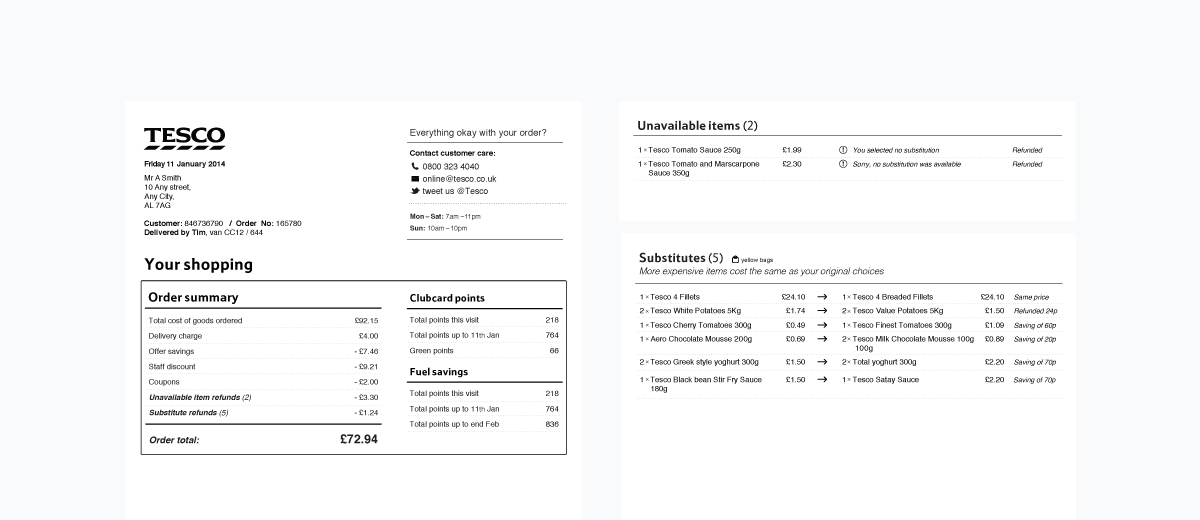
One of the broader journeys I worked on was delivery. From selecting a delivery / collection slot, all the way to getting your order at your doorstep. This included more areas such as amending an order, delivery receipt, managing substitute items and finally communicating timing and total price.
Approach
Collaborating with product owners I was able to gather valuable information from a variety of stakeholders and get deep understanding of the needs and complexity, as well as the interconnection within different areas of the website. This included talking to distribution centre managers, call centre staff, delivery drivers and finally joining delivery sessions. As a result I was able to experience the journey from all angles and test concepts with customers in live environment.
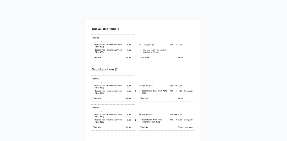
Main topics over customer service calls were missed offers caused by unavailable or substitute items within a multi buy offer (set of multiple items).
Working on the Customer Delivery we discovered how Tesco deals with the issue and that an offer is always honoured, even if it is not completed by the initially purchased items. The answer was there, but was not communicated in the appropriate context.


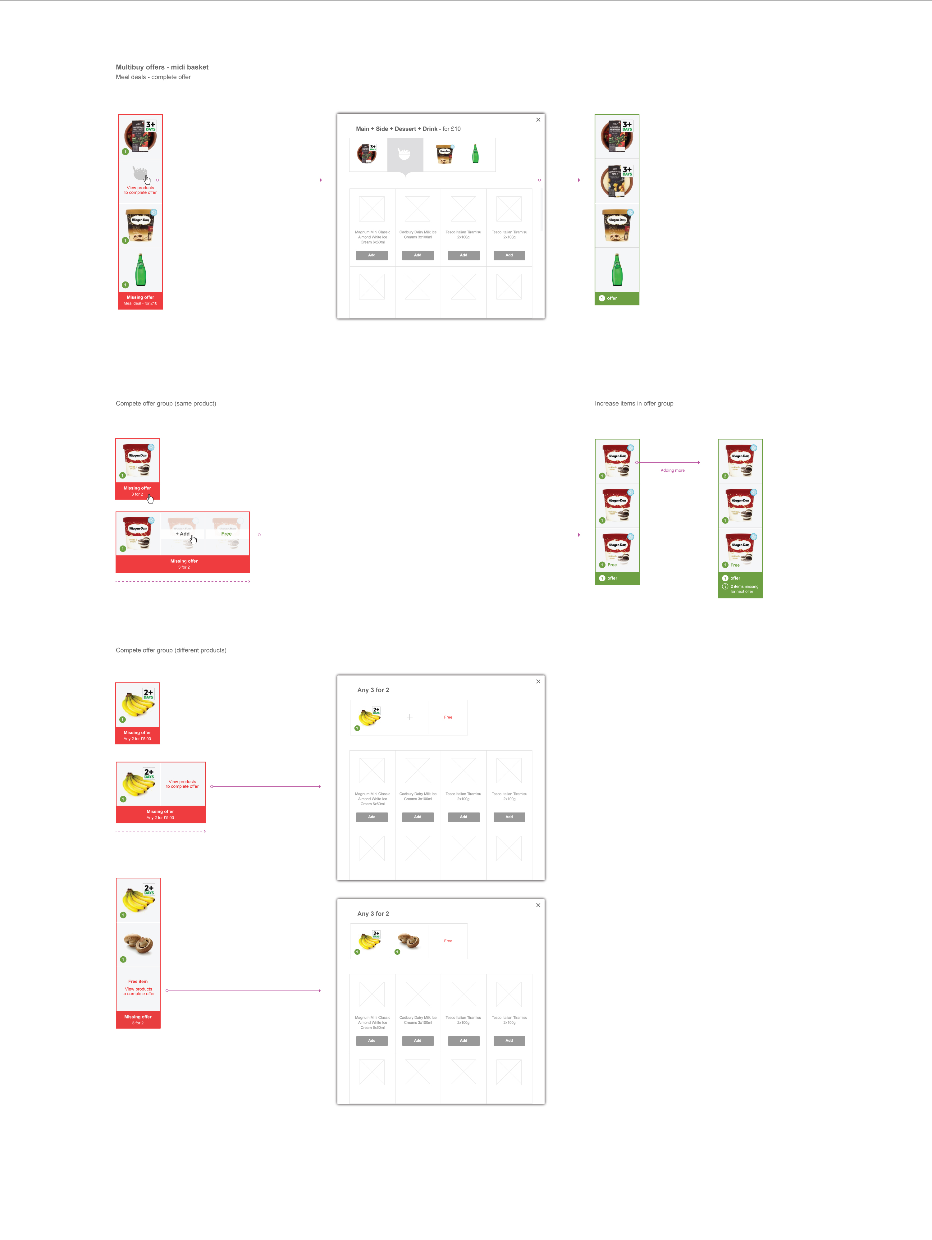
After working on a design solution for the receipt, we realised that the issue was starting from a much earlier stage in the journey, when selecting and adding multi-buy offer items in the basket. A model of treating offers as a single product was then explored and applied to all kinds of offers. This was simply grouping offer items in an offer group, which could be better communicated and also edited in further stages of the user journey. This provided better clarity especially when dealing with multiple offer groups within the same offer as well as a visual incentive to add missing products in order to complete a multi-buy offer.
Further research and testing on site emerged another significant issue, where almost 50% of users were not aware of the payment process through their account. This resulted in several cases where customers assumed the order associated funds had been paid, when it had not. The process was simply waiting for the final receipt to be generated of potential unavailable and substitute items. This led in confusion as there were times when there was not enough funds in the account to process the order.
Prioritising this information visually over the order summary in checkout confirmation page, we were able to present the account payment process through a simple four step journey. This communicates / educates customers on the complete process with exact dates and also introduces the option to amend an order. The coming steps are followed by message reminders and order updates on unavailable and substitute items.
 Previous Project
 Next Project
 Previous Project
 Next Project


