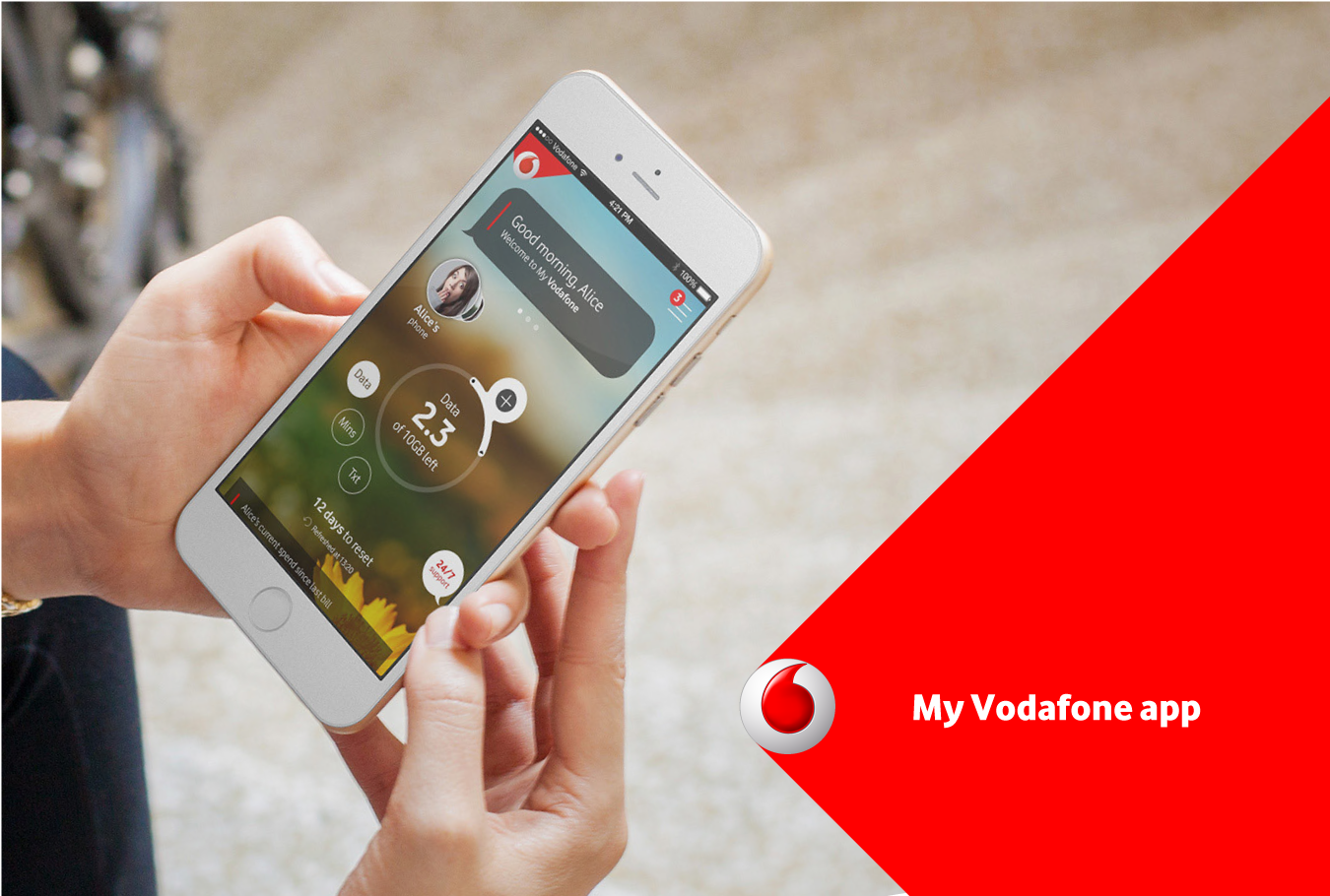
‘My Vodafone’ app
Challenge:
‘My Vodafone’ app is used my millions of users across different countries. I joined the in-house UXD team via BAE System Applied Intelligence, in a collaboration with business analysts from another agency.
When I joined the first release of the app had already been launched, so my task was to work on missing journeys as well as complete and enhance existing ones. During my time on the project I worked on multiple areas of the app, but my fully completed areas was Billing and Product & Services.
Approach:
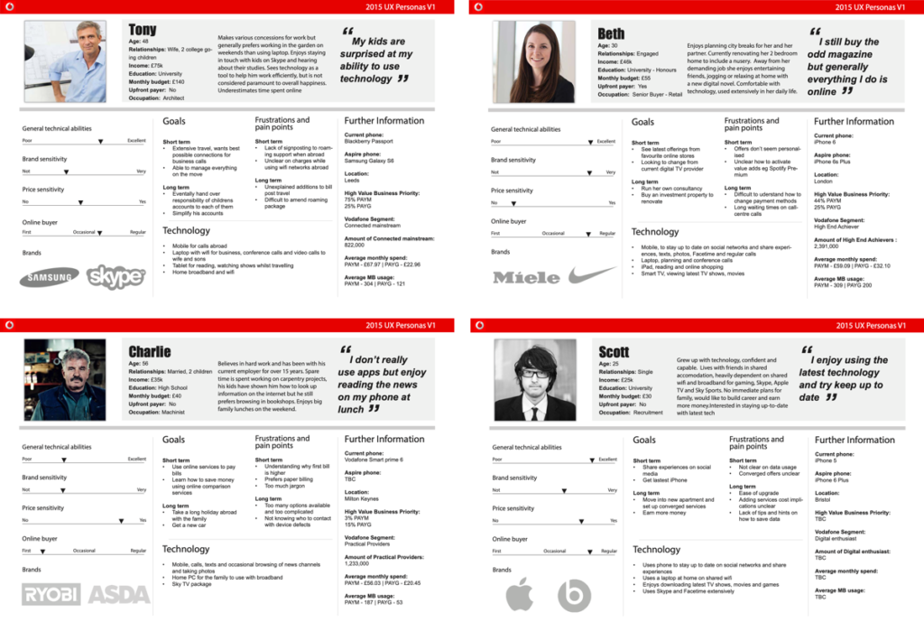
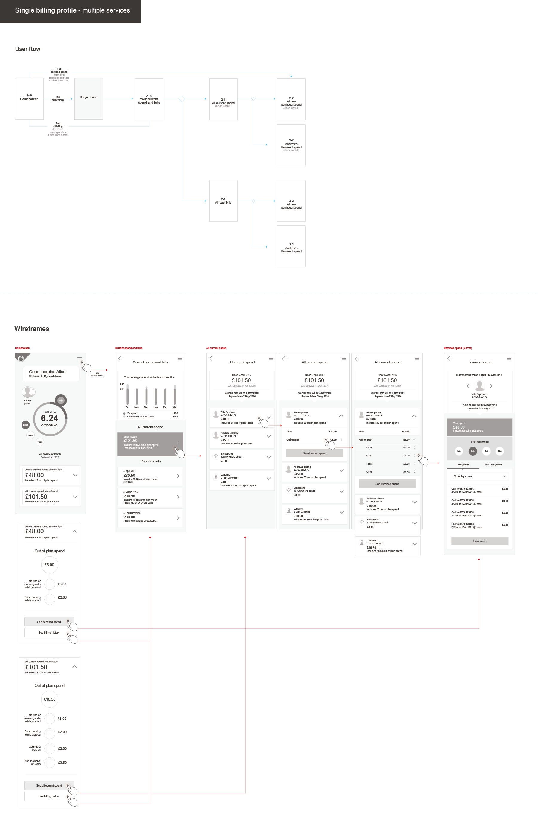
The initial approach was to examine current designs and how they tested. This helped in identifying potential gaps as well as new needs, which would then map to relevant users per scenario. Sometimes specific new personas were necessary in order to fully communicate a specific set of needs and comparison between them. For example the differences between a ‘pay monthly’ versus ‘pay as you go’ plan, both for direct level user as well as parent/billing level user.
User Personas:
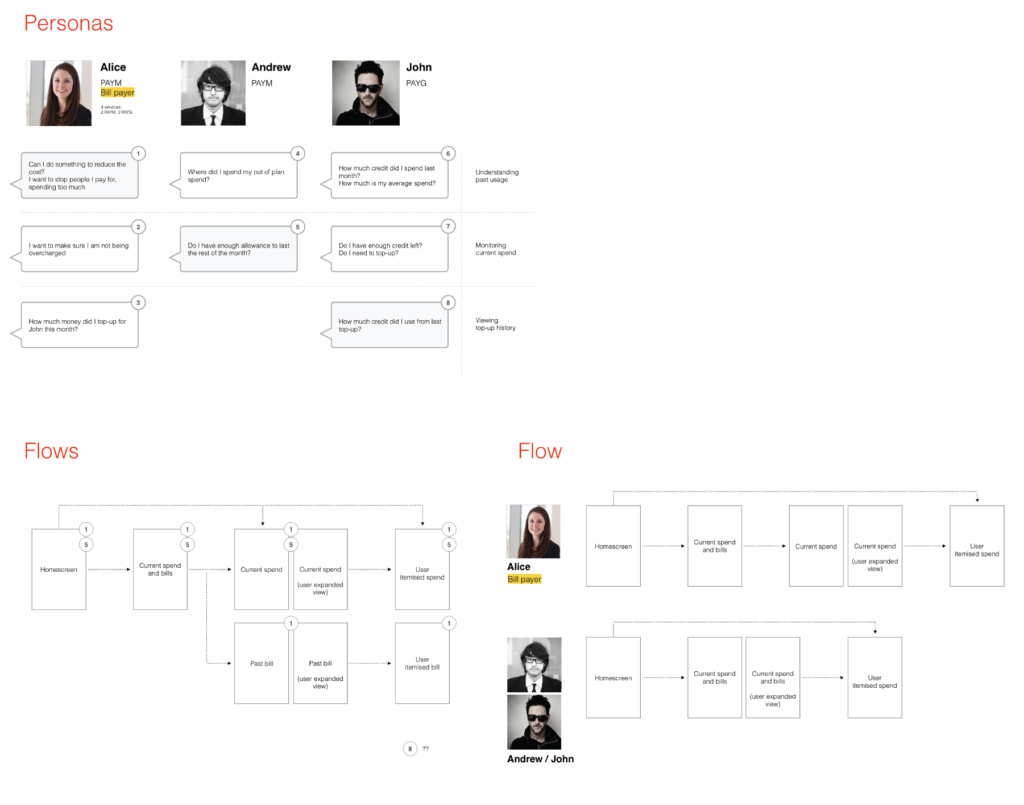
Task specific flows & use of personas:
Use of existing personas to identify task specific needs and mark on the relevant flows. This resulted in consistently effective solutions across all personas and types of needs.
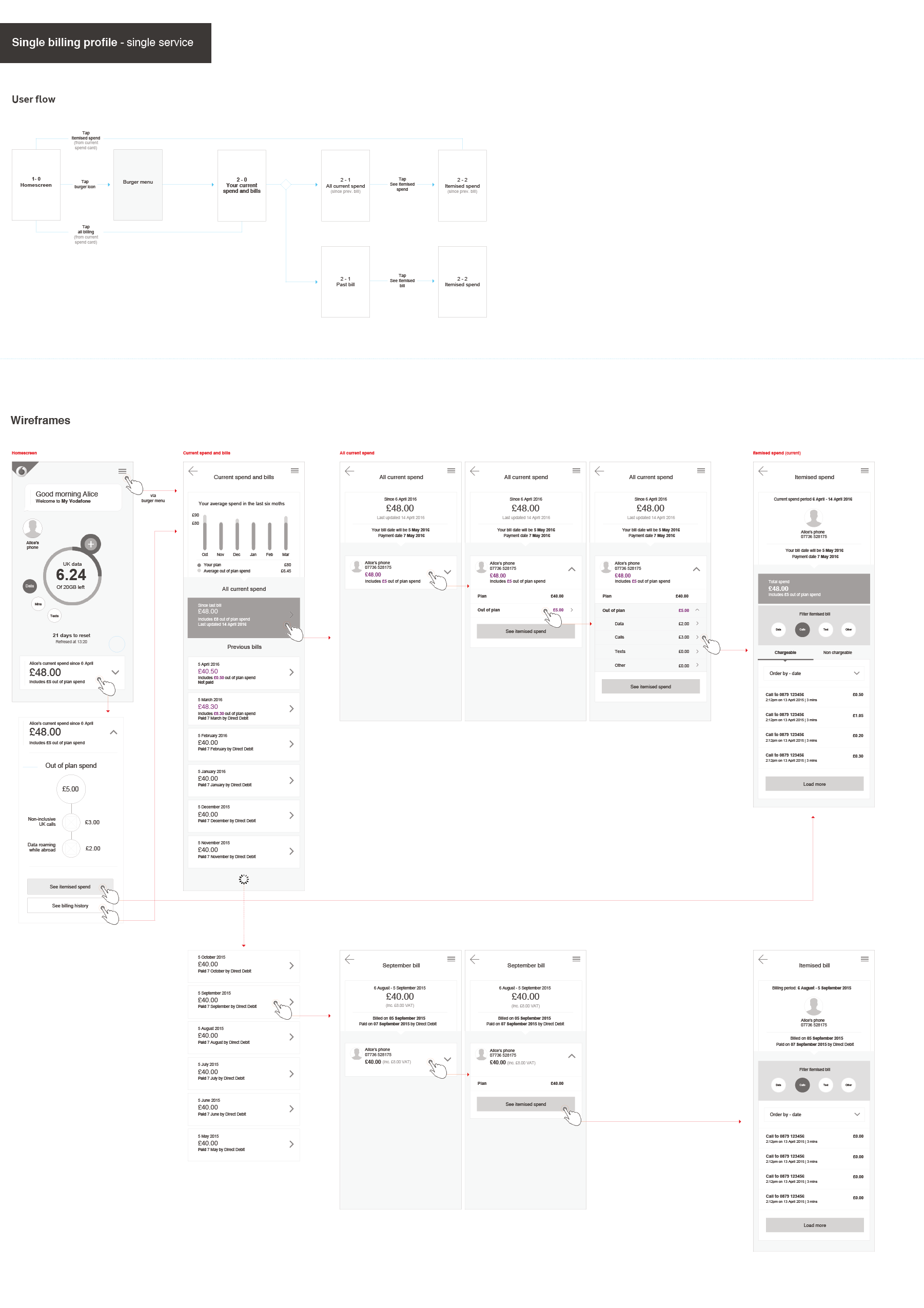
The creative direction had been set in very early stages of the project, meaning we were restricted to using a specific style of components with minimal altering flexibility. However, by working closely and on a very agile back and forth process between UX and Visual designers this was effectively managed. Therefore, all wireframes had to be on a higher fidelity level than usual. Through this approach any changes were very quickly implemented into a very high fidelity prototype that could provide very effective user feedback.
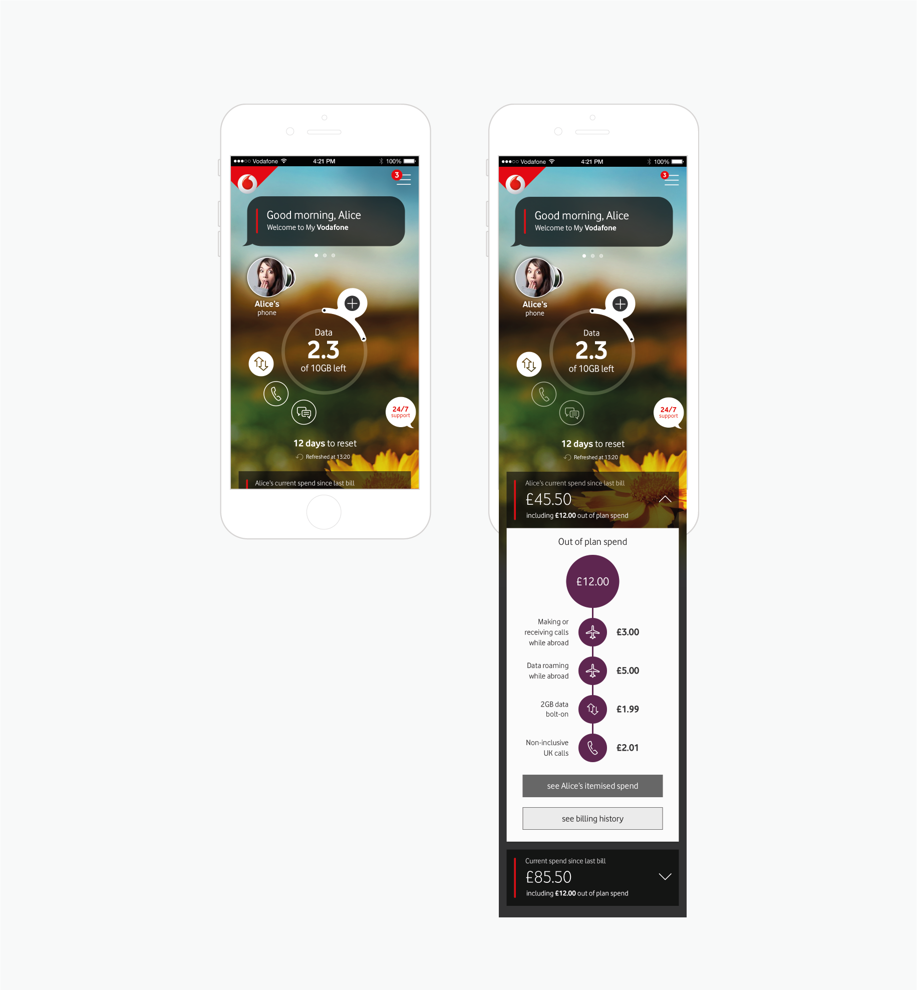
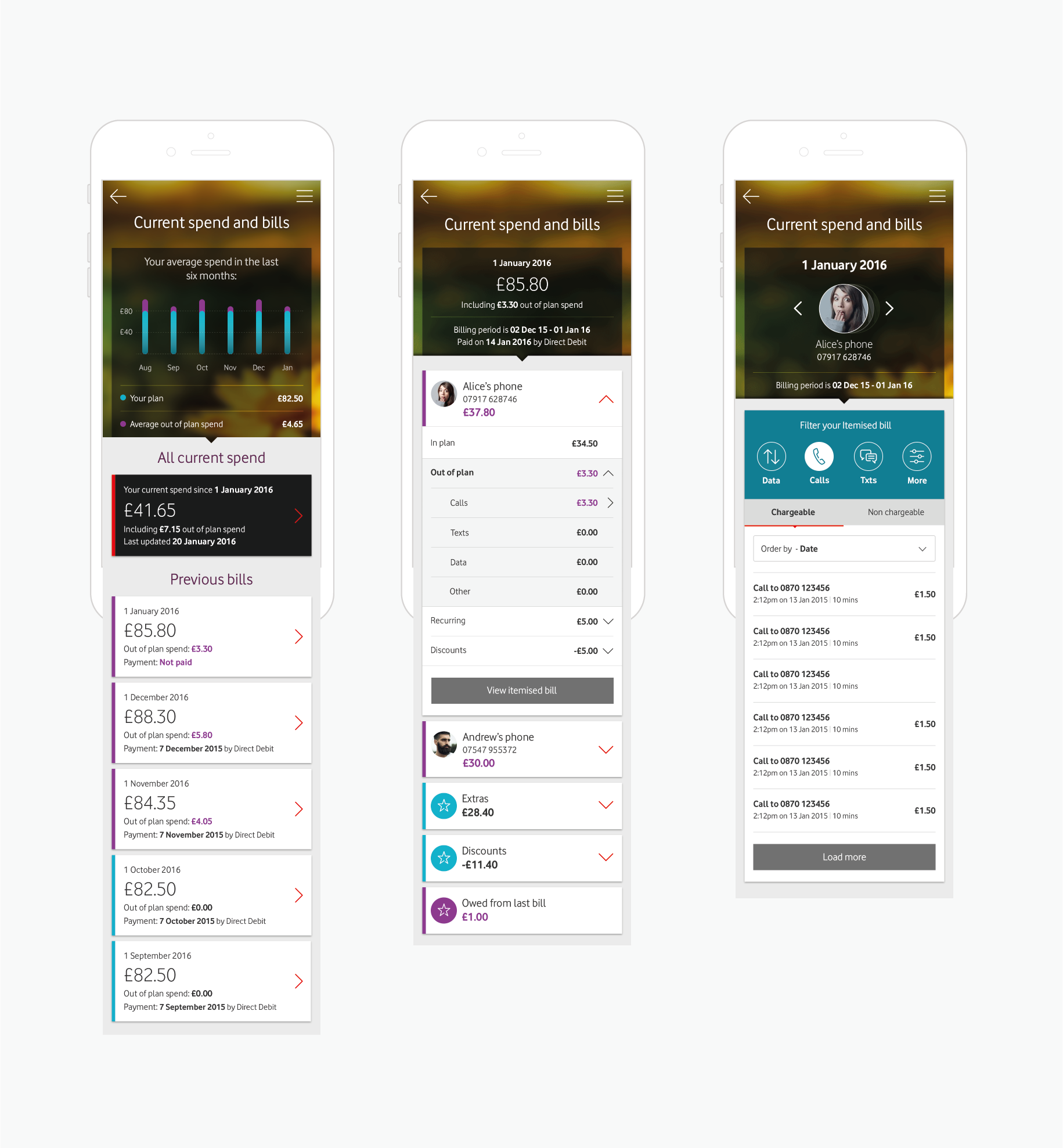
Billing
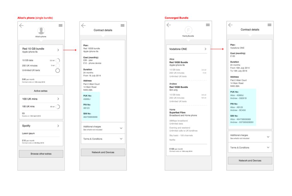
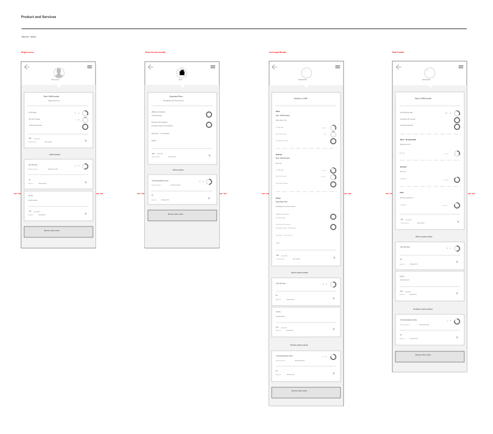
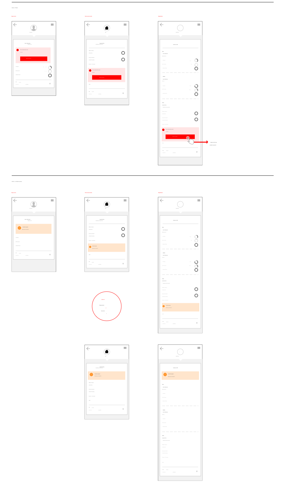
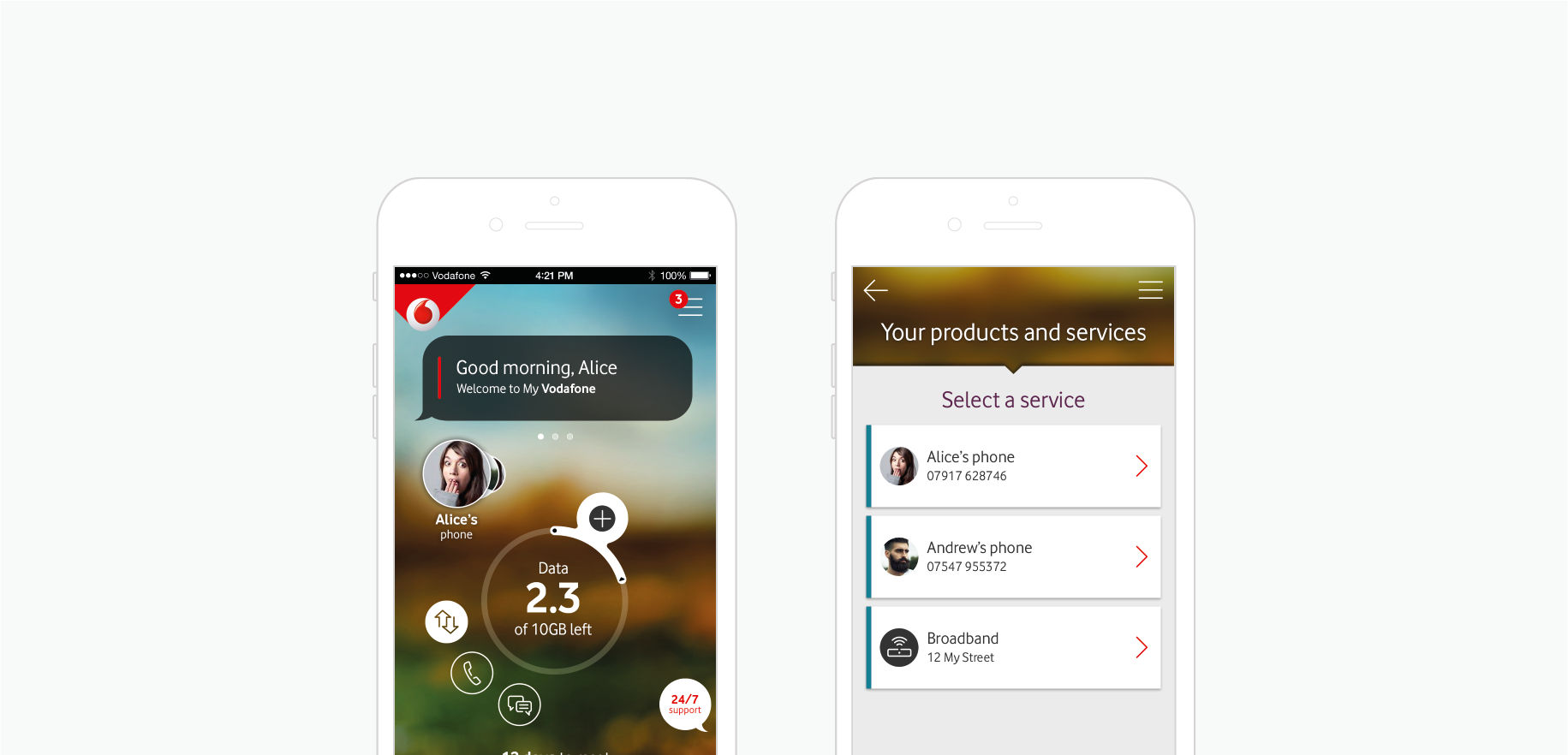
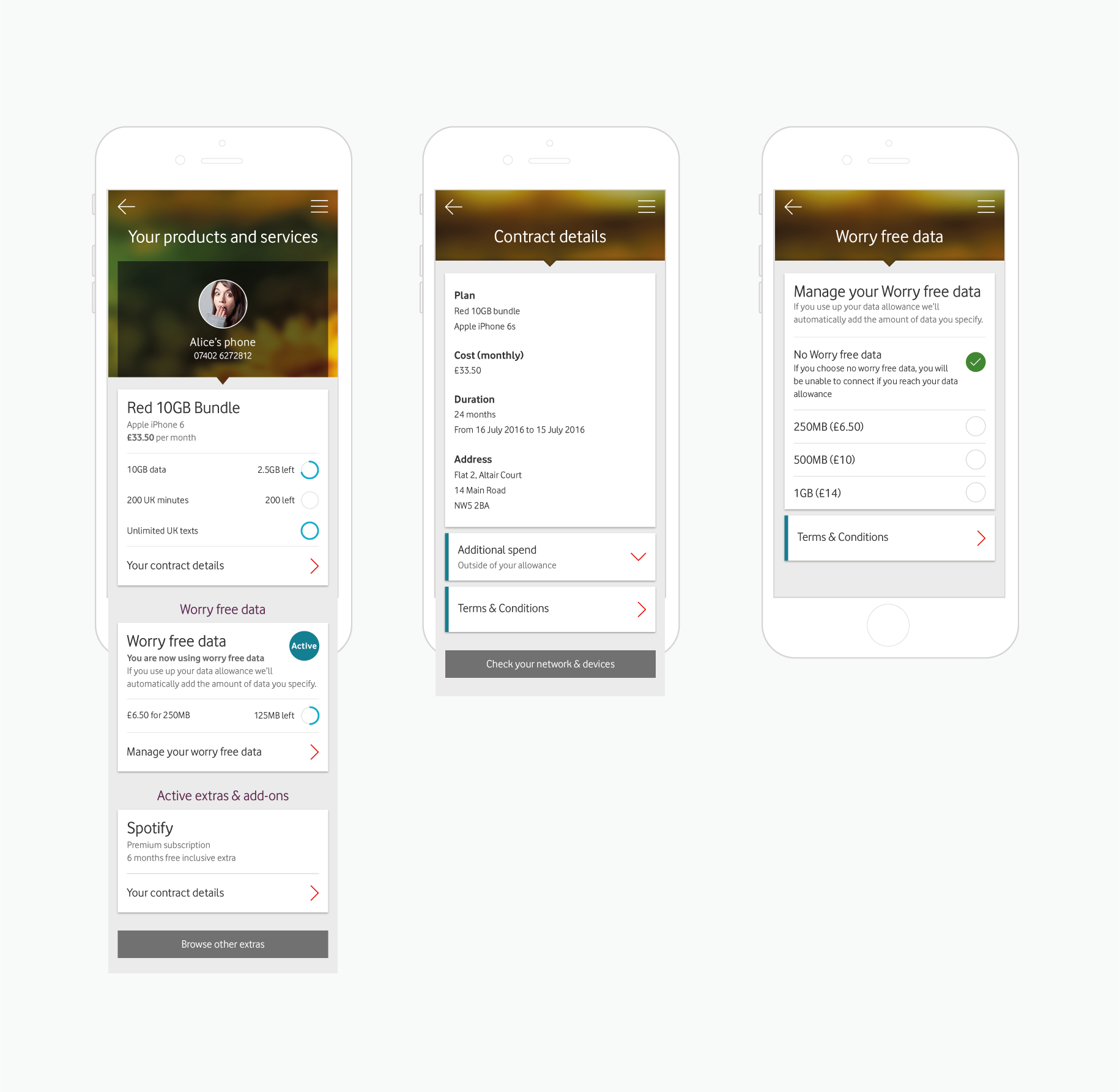
Products & Services
One of the main challenges in Products and Services area was the excessive amount of information. Additionally the business requirements wanted to keep usage details as a very prominent element and the existing designs, which unfortunately were creating conflicts between design elements.
Through plenty of iterations and testing we concluded in prioritising different information per section, as the main plan details was clearly the information users were mostly looking for in this area. To satisfy business requirements, usage elements were preserved, but in a toned down approach in the form of a list. That helped both readability of the information as well as the ability to check usage data at the same time. Finally, deeper navigational levels were formed to accommodate extra (de-prioritised) information that was almost never requested by users (ts&cs etc).
As a result we have more screens and navigation levels, but these are less dense and display more accurate and contextual information. Test results showed users had no problems navigating easily between levels and finding all the required information.
 Previous Project
 Next Project
- Categories:
- Share Project :
Previous ProjectNext Project