USA Exchange

Challenge:
Betfair Exchange is an innovative betting platform that allows peer to peer betting on a variety of sports. This way users can bet on both sides of a result (hedging) at odds set by themselves or other users; a similar concept to stock exchange markets. With Betfair launching Exchange at the US market, I was responsible for the redesign project. The US version of the product features only horse racing.
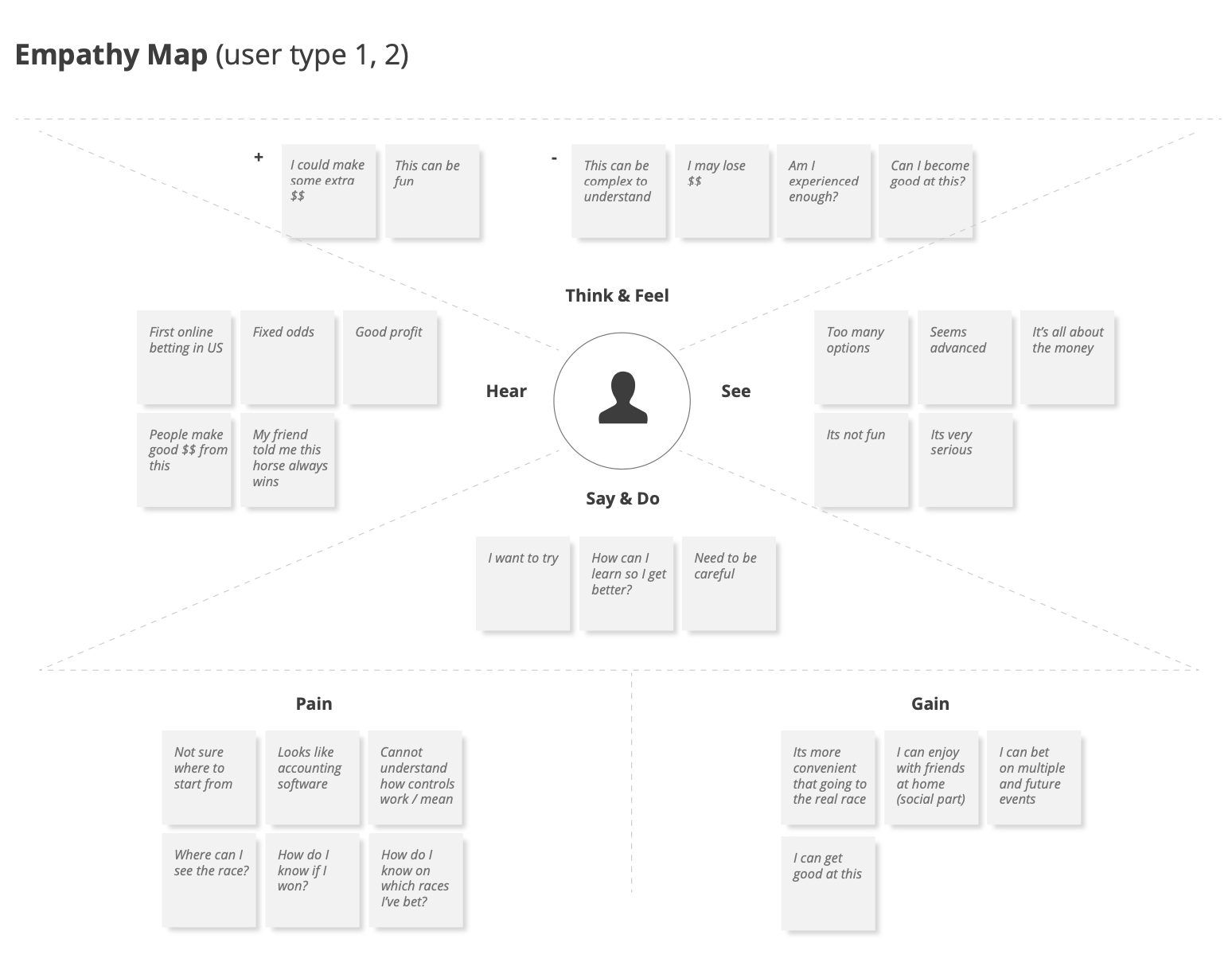
Exchange has been quite a sophisticated tool for advanced users and traders. However as online betting was new in the US, we had to focus more on new customers, whilst maintaining and enhancing the advanced features and strategies. The main challenge was to engage new / recreational users, show the potential of the service and simultaneously educate them in getting the most of it.
Furthermore, business needs required customers to use the lay side bets too (bet to lose), in order to maintain liquidity within the markets. This has always been the most complicated part of the service. Even users who were using it were struggling to explain how it actually works.
Approach:
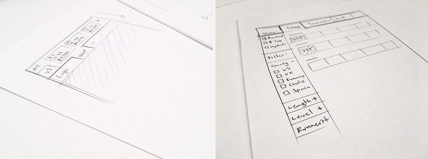
Working close with the lead user researcher, I was able to see previous testings on the existing product which helped in identifying key problems and user needs. At the same time by talking to stakeholders and current users within all levels, we were able to map user behaviours and strategies to the existing user persona profiles.
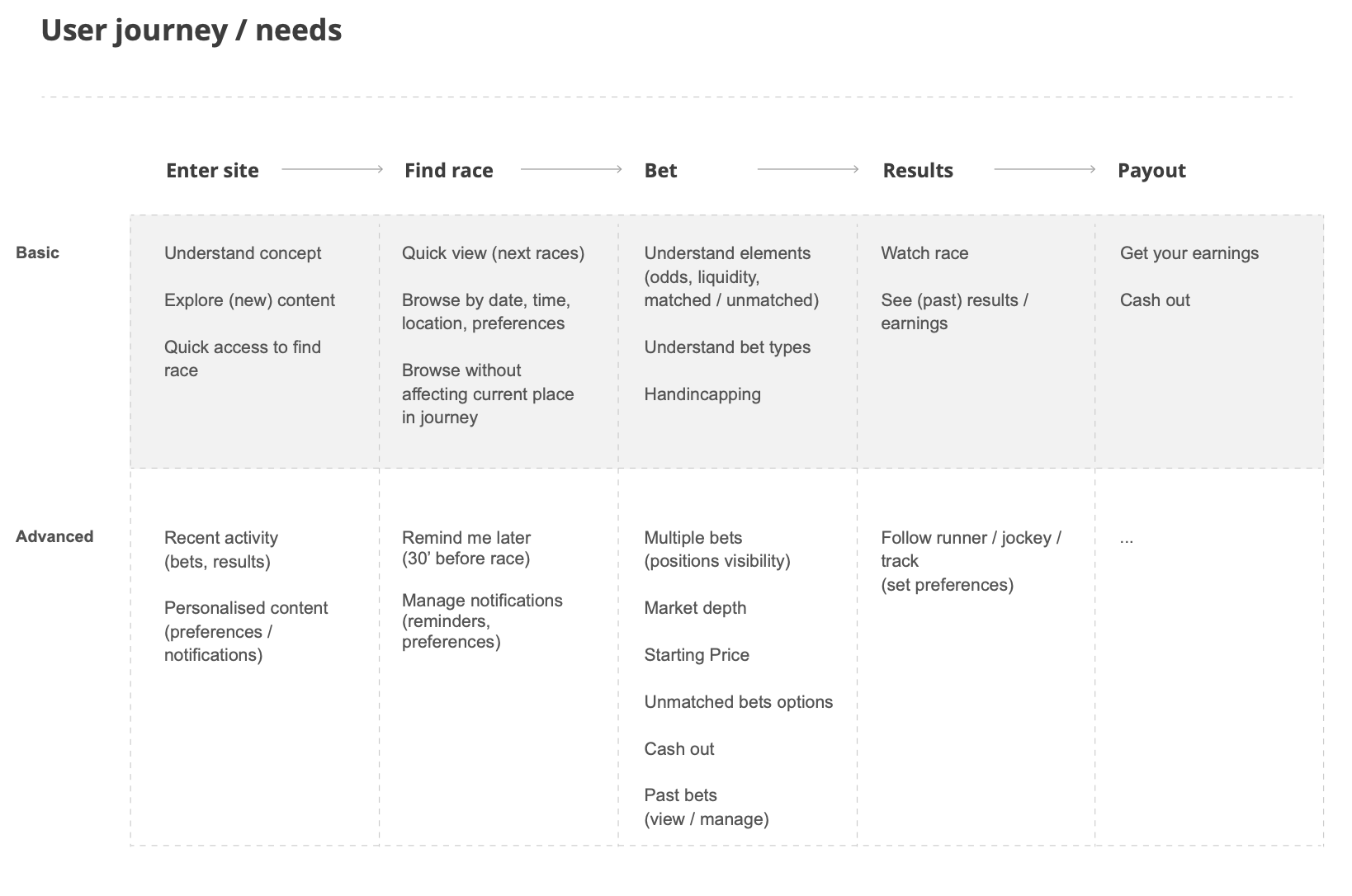
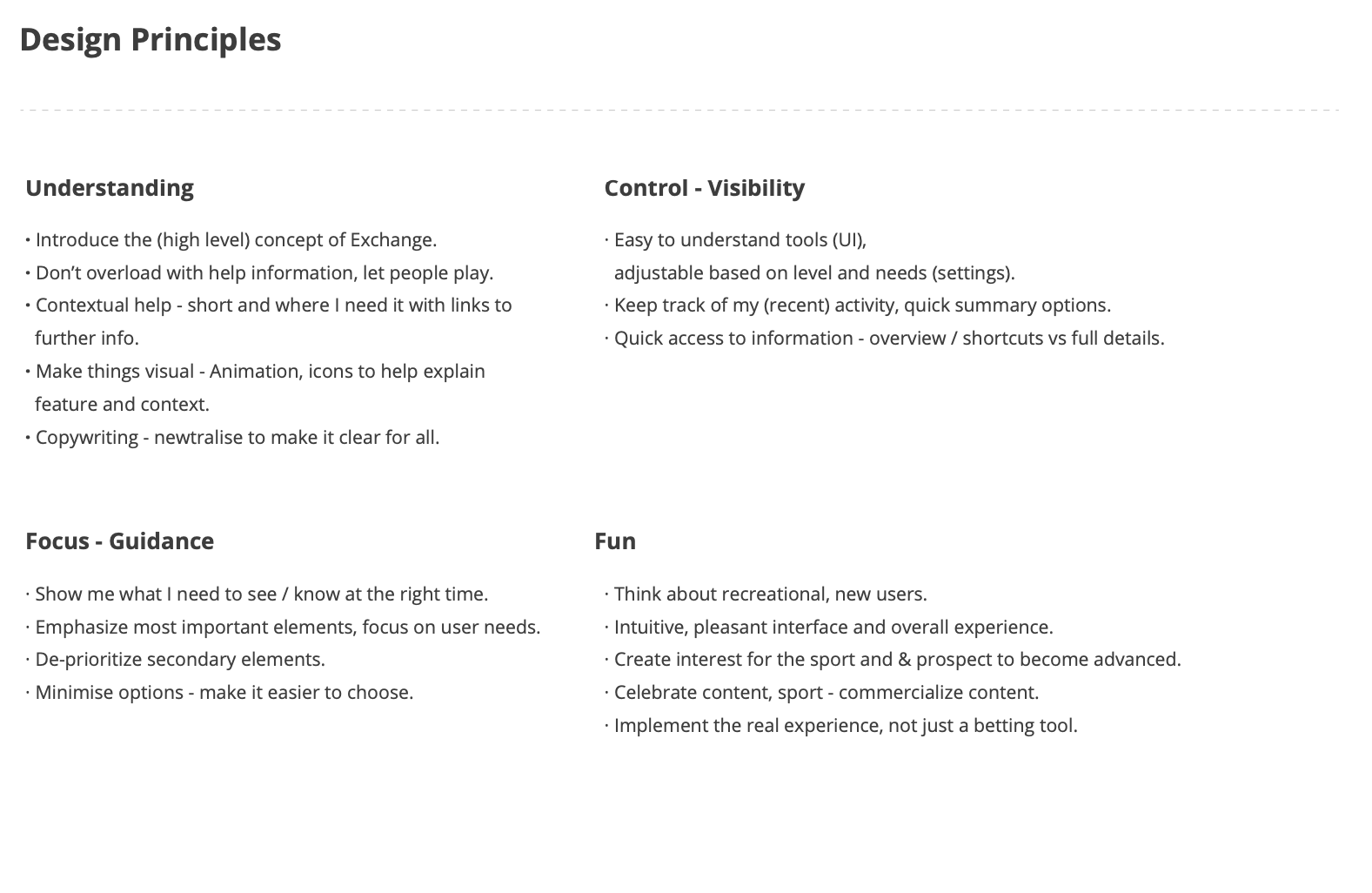
Starting with a basic end to end journey we went through an ideation phase to identify main areas and features to improve, through new concepts. Next step was to set design principles and divide work into sprints. The overall approach was to start with a simple journey that would depict new user behaviour and keep iterating on it, whilst focusing on individual areas and more advanced features per sprint.
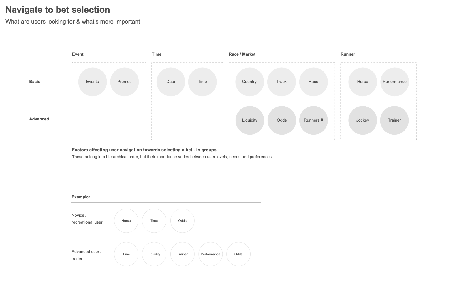
Through testing early concepts, we were also exploring how different type of users were navigating, what elements were more important to them and why. Taking into consideration the strong relationship with the physical experience (going to the track) was critical in forming the Information Architecture and key interactions, as well as adding new content and flexible navigation routes.

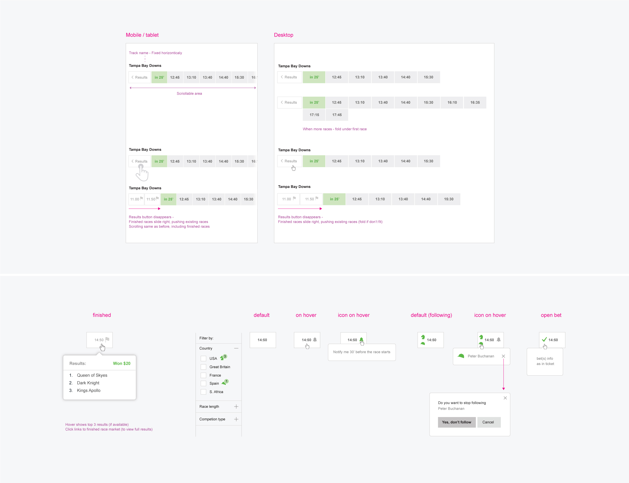
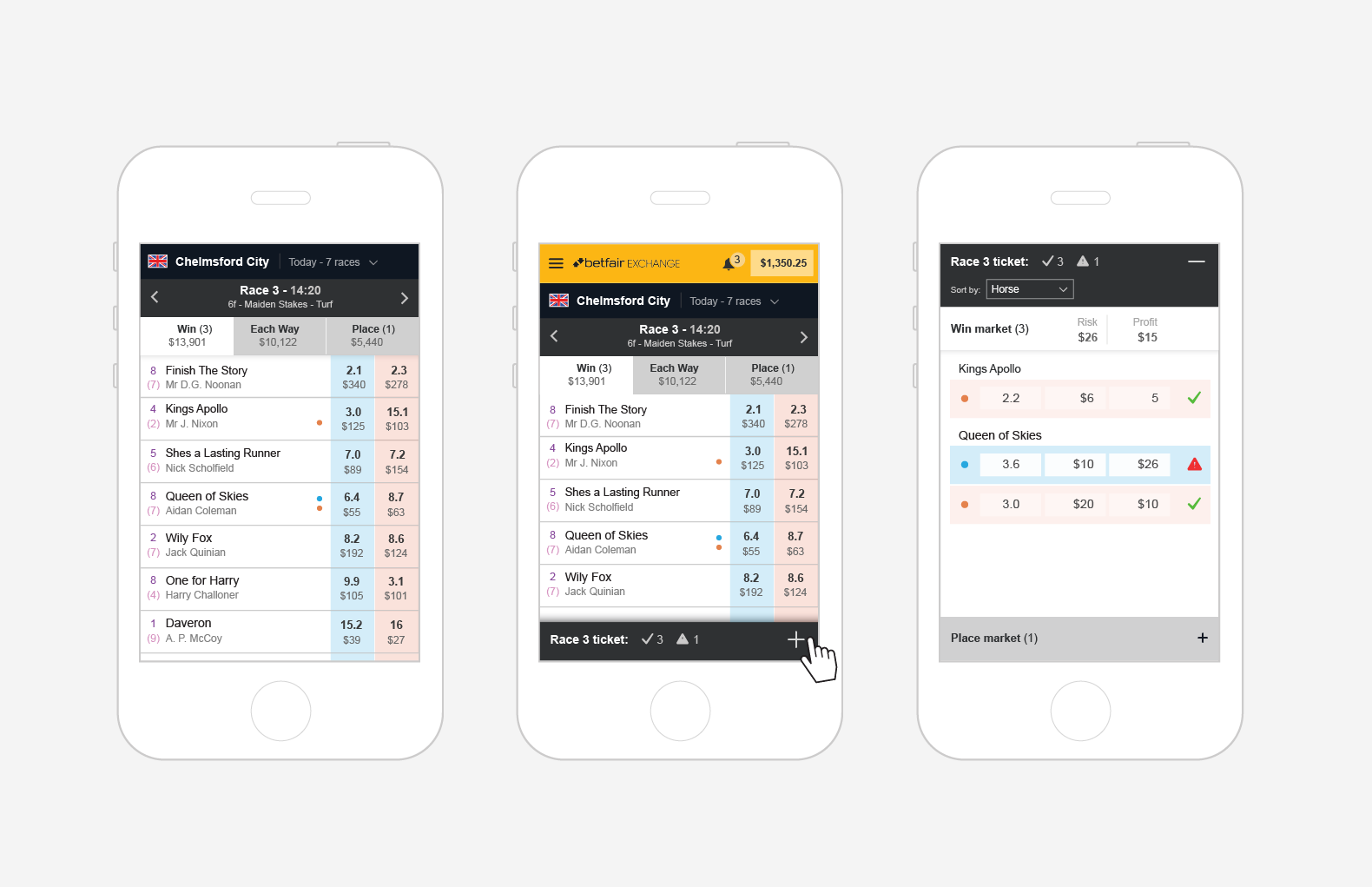
Next race(s) can be seen at any time without necessarily redirecting to a dedicated page. Colour coding allows quick visual scan of time information with minimal reading. Additional filtering caters for the US audience.
![]()
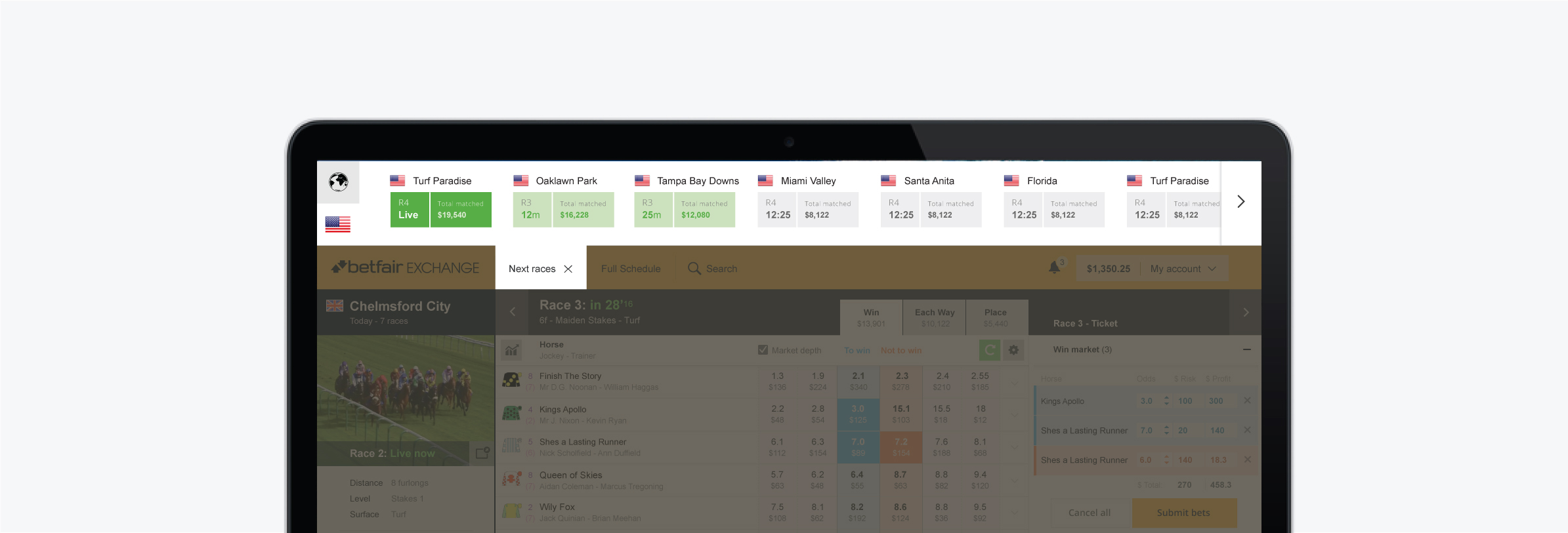
Parent – Child relationship of Track and Races is highly emphasised through new layout and motion effects, allowing full visibility, clarity and enhanced activity options within races in a track.

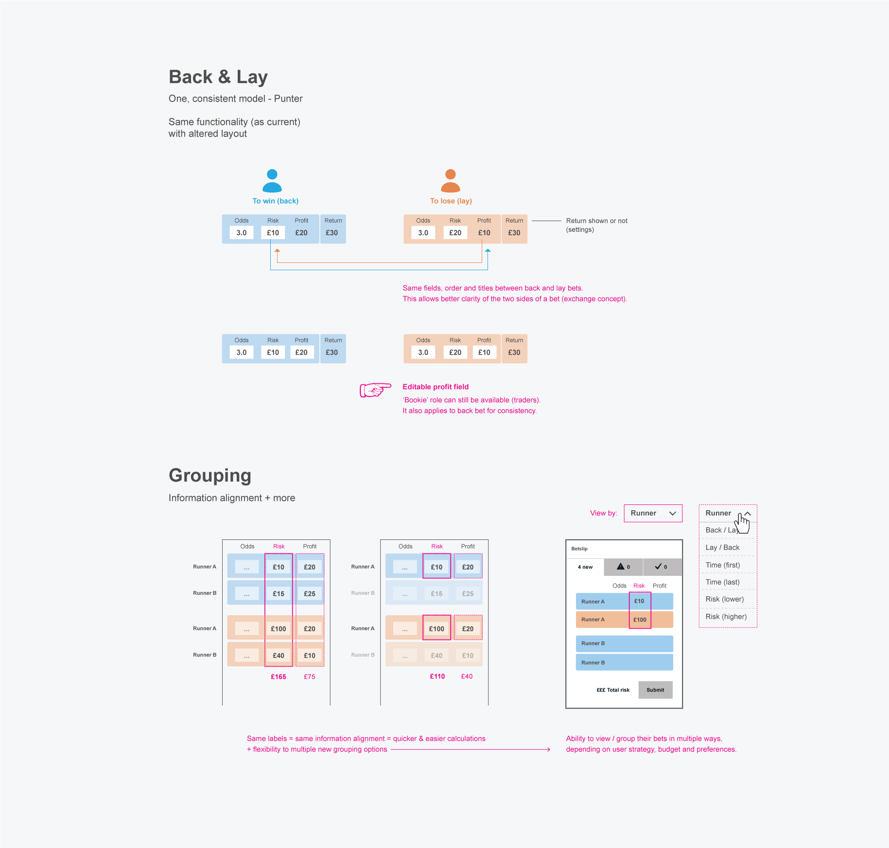
New layout and information grouping to communicate ‘lay’ side and enhance hedging strategies by providing full visibility of user’s betting activity (positions) and risk.

Outcome:
- Through simplified copywrite, contextual help and visual guidance, new users understand the UI elements and as a result they also understand the concept of Exchange.
- Simple navigation, with clarity of hierarchy and position within journey. Users are able to browse easily within races, viewing relevant information at the same time without redirecting. Advanced users also benefit from overview features when placing multiple bets in a day.
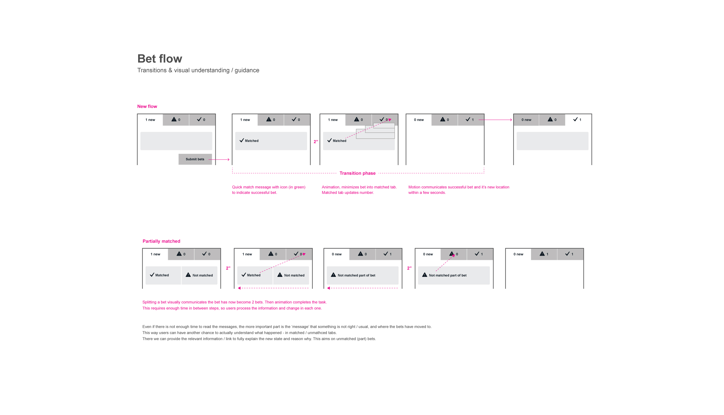
- Race specific betslip (race ticket) has been a major change, allowing users to easily manage bets within multiple markets of a race. Combined with motion effect it communicates both Parent-Child relationship between Track and Race, as well as the fact that every race has its own ticket.
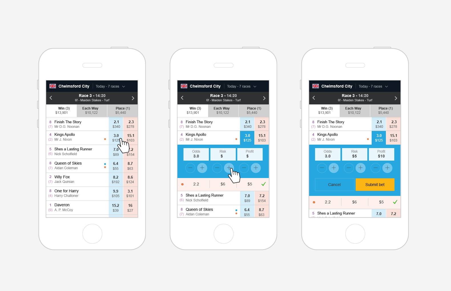
- New bet design makes ‘lay’ bets clear and very easy to calculate total risk / profit. Most importantly it promotes the hedging model by grouping the bets and allowing effective view and management of both sides of a bet.
 Previous Project
 Next Project
- Categories:
- Share Project :
Previous ProjectNext Project